[ geeks-space ] emotion으로 storybook에 global 스타일 적용하기
2022. 3. 4. 10:29ㆍprogramming/사이드 프로젝트 스터디
rem단위로 작업을 하려 하는데, 스토리북에 글로벌 스타일을 적용하는 방법을 몰라 당황했다.
그냥 css를 import해도 된다고 하는데(아래 블로글 참고), emotion에도 글로벌스타일 기능을 제공하고,
이왕 스터디 하는거 emotion으로 적용하는 방법도 알아두는 것이 좋겠다고 생각했다.
실제로 프로젝트에 반영하는 글로벌 스타일과는 별개로 스토리북을 위해 preview.js 라는 렌더링 설정 파일에 따로 적용을 해줘야한다. ( 프로젝트에 반영되는 스타일과, 스토리북에서 확인한 스타일이 달라지는 일이 없도록. )
1. 테스트를 위해 src/components/Button.tsx 컴포넌트 생성
import React from "react";
import styled from "@emotion/styled";

interface ButtonProps {
  label: string;
  size?: "small" | "medium" | "large";
  type?: "primary" | "secondary";
  action?: "hover" | "warn" | "none";
  onClick?: () => void;
}

const Button = ({ label, size, type, action, ...props }: ButtonProps) => {
  return (
    <Styled.Button size={size} type={type} action={action}>
      <div className="button" role="button" {...props}>
        {label}
      </div>
    </Styled.Button>
  );
};

const Styled = {
  Button: styled.div<{
    size?: "small" | "medium" | "large";
    type?: "primary" | "secondary";
    action?: "hover" | "warn" | "none";
  }>`
    display: flex;
    justify-content: center;
    align-items: center;

    width: ${({ size }) =>
      size === "small" ? "9.6rem" : size === "medium" ? "20.8rem" : "40.8rem"};

    background-color: ${({ type }) =>
      type === "primary" ? "#5865F2" : "#3BA55D"};

    &:hover {
      background-color: ${({ type, action }) =>
        type === "primary" && action === "hover"
          ? "#4752C4"
          : action !== "none" && "#2A7441"};

      border: ${({ type, action }) =>
        type === "primary" && action === "hover"
          ? "1px solid #4752C4"
          : action !== "none" && "1px solid #2A7441"};
    }
    border: ${({ type }) =>
      type === "primary" ? "1px solid #4752C4" : "1px solid #3BA55D"};
    color: #fff;
    border-radius: 5px;

    .button {
      width: 100%;
      cursor: pointer;
      padding-top: 1rem;
      padding-bottom: 1rem;
      text-align: center;
      font-family: JejuMyeongjo;
      font-size: 1.4rem;
    }
  `,
};
export default Button;
2. 스토리 작성 src/components/button.stories.tsx 생성
import React from "react";
import { ComponentStory, ComponentMeta } from "@storybook/react";

import Button from "./Button"; //1번에서 만든 Button컴포넌트 import

// 어떤 컴포넌트의 story인지, 어떤 설정으로 렌더링할지 정의
export default {
  title: "stories/Button",
  component: Button,
} as ComponentMeta<typeof Button>;

// 템플릿의 기본 포맷을 정의.
const Template: ComponentStory<typeof Button> = (args) => <Button {...args} />;

//위에서 정의한 포맷을 bind함수를 통해 묶어준 뒤, 각각 다른 args를 넘긴다.
export const Small = Template.bind({});
Small.args = {
  size: "small",
  label: "Button",
  type: "primary",
  action: "hover",
}; //Small은 bind를 통해 <Button size="small" label="button" tpye="primary" action="hover" />;
//요런 템플릿이 된다.

export const Medium = Template.bind({});
Medium.args = {
  size: "medium",
  label: "Button",
  type: "secondary",
  action: "hover",
};

export const Large = Template.bind({});
Large.args = {
  size: "large",
  label: "Button",
  type: "primary",
  action: "hover",
};
3. 스토리북을 확인해 보면 아래와 같이 나온다.
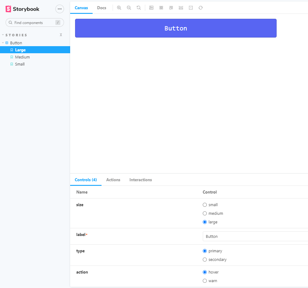
나는 14px을 생각하고 버튼의 font-size를 1.4rem을 줬는데, 22.4px로 더 크게 적용이 되었다.
html의 폰트사이즈를 10px로 설정할 필요가 있다.
4. 글로벌 스타일에 폰트 사이즈 10px 주기
// src/shared/global.js
import { css } from "@emotion/react";

const reset = css`
   html {
    font-size: 10px;
  }
 `;
export default reset;
5. .storybook/preview.js에 설정 추가하기
// 아래 코드를 추가해준다.

import { Global } from "@emotion/react";
import reset from "../src/components/ui/shared/global"; //내가 작성한 글로벌스타일 경로

export const decorators = [
  (Story) => (
    <>
      <Global styles={reset} />
      <Story />
    </>
  ),
];
스토리북을 다시 실행시키면 font-size가 14px로 적용된 것을 볼 수 있다.
// 추가예정
ComponentStory란?
ComponentMeta란?